Direction A
Rings 年轮
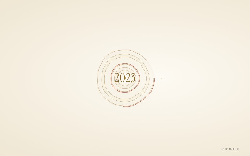
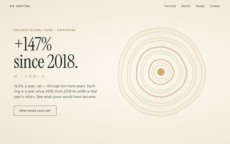
Now on warm cream paper, rings in gold and rust. A tree's rings draw themselves, one per year since 2015 — each ring's width is that year's actual return. The two losing years leave narrow, rust-coloured rings. Every ring a year. The narrow ones too.
- Cream, antique gold, rust, soft sage. Serif.
- Feels: old-money, heirloom, quietly certain.
- Chinese line: 恒 · 十年如一日
Direction B
Horizon 旭日
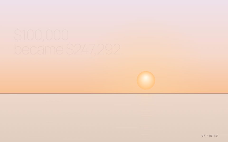
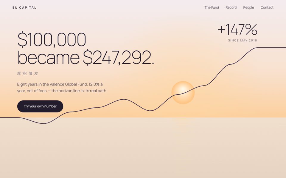
Now opening at first light — pale lavender instead of night. The original: night over still water. A single line of light draws the horizon, dawn breaks, the sun rises — and then the horizon itself lifts and bends into the fund's real record, ending at +147%.
- Dawn plum, apricot, cream. Light modern sans.
- Feels: warm, optimistic, contemporary.
- Chinese line: 厚积薄发
Direction C
Ledger 让数字说话
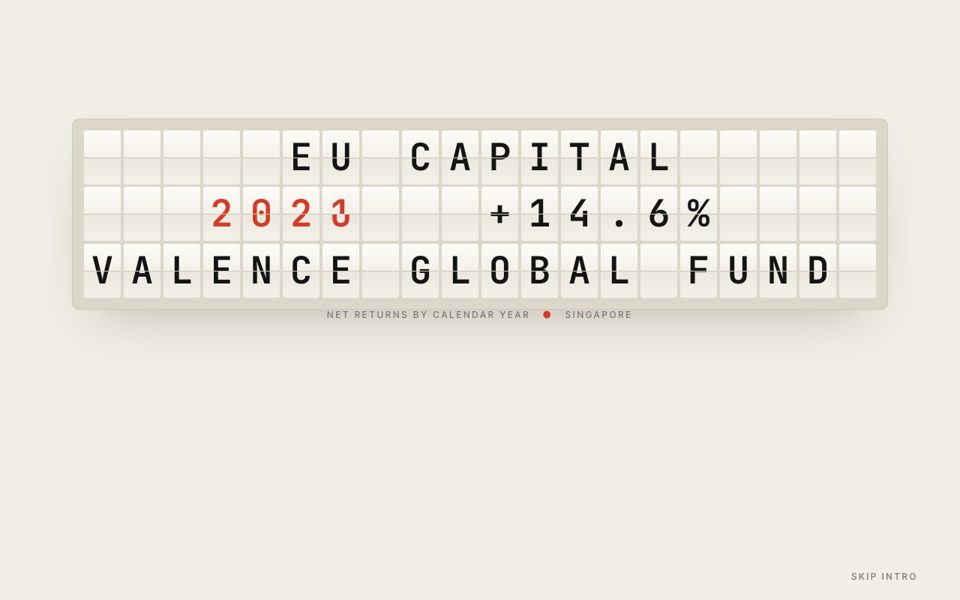
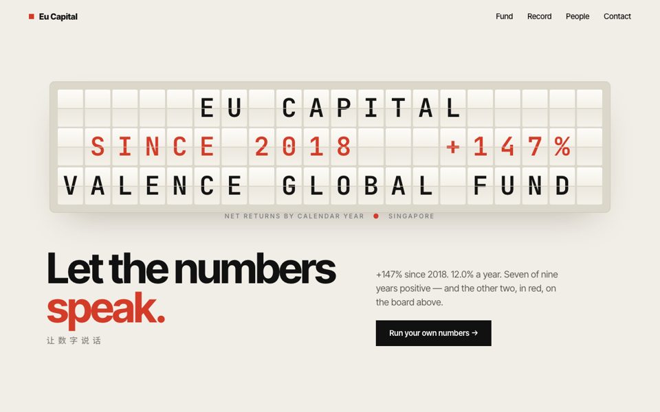
Now ivory flaps with black figures, like a paper ledger. A split-flap board — the clattering quote boards of the old stock exchanges — flips through every calendar year's return, losses in red, then settles on Since 2018, +147%.
- Paper white, ink black, one vermilion. Bold Swiss grotesk.
- Feels: confident, precise, nothing hidden.
- Chinese line: 让数字说话